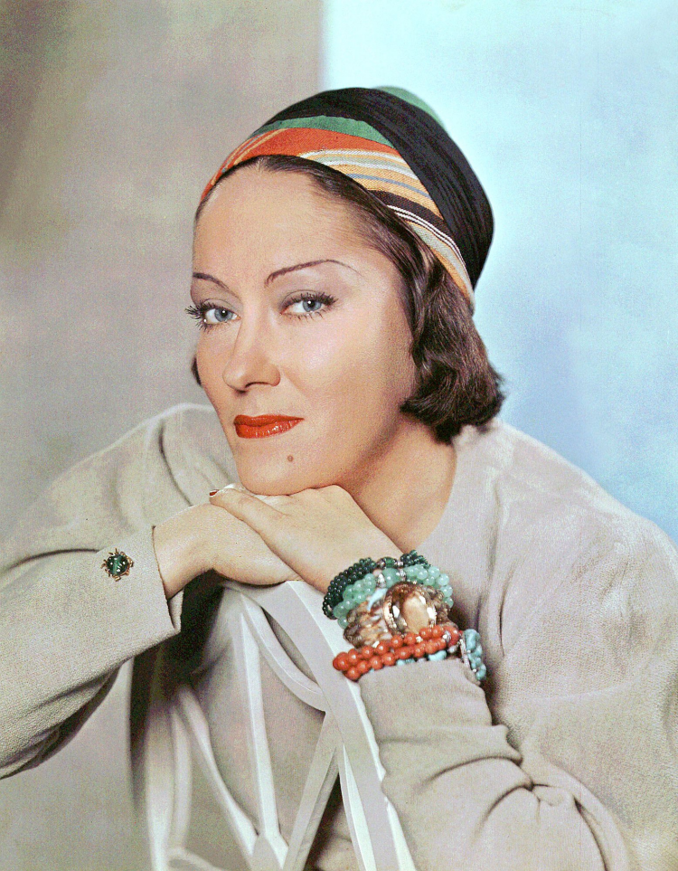


Color photography - both motion picture film and still photography - has had a long and fascinating history. And some of the most important technical advancements happened during the 1930s. Though Hollywood had been toying with various versions of Technicolor motion picture film for almost twenty years, there really wasn't much in the way of color portraiture until the middle of the Thirties. And at least at first, most of it seems to have been produced for use on magazine covers and in advertisements. If I understand correctly, in the early and mid-Thirties most color photographs were taken using the Carbro process, Kodachrome only becoming commercially available in 1938. (In fact, I "understand" just about nothing of the history or technology of color photography, so I'll have to leave it at that one spare sentence.) Though black and white studio portraits remained the norm well into the Sixties, after the early Forties color portraiture would become quite common in Hollywood. The images I've shared here are examples of that early, transitional period.


 |
This portrait of Dietrich is an example of something I've encountered more frequently in vintage Hollywood color photographs than in black and
white images of the same period: they're often reversed. This seems to be the most frequently seen version of the shot, but I believe it to be reversed.
If for no other reason than that her hats always leaned the other way. But both orientations were printed and she happily signed both versions. |
 |
Another portrait from the same sitting, but printed, I believe, in the correct orientation.
(And while the cover reads "Natural Color Photo", there's obviously nothing at all "natural" about the heavily retouched final image.) |


When speaking of color portraiture from the golden age of Hollywood, one has to bring up the ugly topic of "colorization." The 1970s and '80s saw a wave of colorizing classic black and white films, an appalling development which brought on an immediate and righteous outcry against it. The arguments were aesthetic - the technology was crude, the resulting images looked really bad; the original design of the films was calculated for black and white and looked wrong with color overlaid - and ethical - no one has the right to make such sweeping "improvements" to someone else's work of art; it's like drawing eyebrows on the Mona Lisa. But now, with great advances in the technology, it's all started again. I haven't seen so much of a renewed attack on classic film, but one more directed at archival documentary footage. The argument made for these alterations is that it makes the old images more accessible to a modern audience; "it brings the past to life!" (Apparently, we modern folks possess a rather limited ability to imagine.)


But much more frequently, because the software is now so readily available, it's
still photography - both historical documents and Hollywood portraits - that has come under attack. Depending on the skills of the person wielding the software, the results vary from the very bad to the very adept. And I have more of an issue with the latter than the former; if the alteration has been done very skillfully, the viewer probably won't even know they're being lied to. Sites like Pinterest are awash with "authentic vintage color photographs" that are nothing of the sort. The internet is a great minefield of misinformation/disinformation, and images that are not what they seem - whether their misidentification is due to carelessness or to deliberate deception - do much more damage than we realize. In a world that is already shockingly dumb, they just make us all that much dumber.
 |
| I didn't crop this portrait of Freddie Bartholomew as the layers of color separation can be seen at the edges. |
Considering the above paragraphs, my tirade against vile colorization, I must make assurances that I've tried - very - hard to only share photographs that I know to have been genuinely, originally shot in color. Including those where the color was "genuinely, originally" very much retouched, in the same way black and white studio portraits were always retouched at the time. But if I've been duped by any clever imposters, I sincerely hope someone will alert me to the fact.
 |
| This portrait of Ginger Rogers looks to be another example of a reversed image being printed - and signed anyway. |
 |
| I'm fairly certain that this is the actual orientation of the photograph. |
*
Since I've found it impossible to give attribution to all of the images here or definitively determine the dates they were taken, I'm resorting to a crude list. The photographers here include: James N. Doolittle, Paul Hesse, George Hurrell, Nickolas Muray, Harry Warnecke, Clarence Sinclair Bull, Anton Bruehl, Scotty Welbourne, Herbert Dorfman, Jack Shallit & Barker Davis, and (probably) others.


